Behind the Scenes of Our Brand Glow-Up
Creative Freedom Thrives with the Right Rules
Ready to Launch your Business Website?
Read on for the step-by-step guide!
Setting up a website is not difficult—Squarespace simplifies it by offering an all-in-one solution to web hosting, design, and domain names.
- Define Your Goals – Define your website’s purpose and target audience before you get started.
- Choose a Domain & Plan – Choose a memorable domain and a Squarespace plan that aligns with your business needs.
- Select & Customize a Template – Pick a pre-designed template and customize it for a polished, on-brand look.
- Optimize for SEO & Performance – Leverage Squarespace’s SEO capabilities for increased discoverability and page load speed.
- Prepare for Launch – Test your functionality, install tracking, and promote your site to drive traffic.
Why We Had to Rebrand Ourselves
As a queer-owned business, we couldn’t wait to brand ourselves with full rainbow colors. We chose pastel tones to feel playful, fun, and inviting. But as a designer, I kept breaking my own rules when designing flyers and webpage examples. I realized I was fighting the color palette because all the hues were so close in value—there was no contrast.
Even worse, we had too many color options and additional gradients to choose from. In theory, that’s exciting! In practice, it completely defeats the purpose of a structured brand guide.
There’s power in limitation.
Color Was the Crux
I knew color was our biggest issue, so that became my anchor when creating Andrews Artistry 2.0. I wanted us to stay true to our voice, while giving ourselves permission to grow—and communicate our expertise.
Even worse, we had too many color options and additional gradients to choose from. In theory, that’s exciting! In practice, it completely defeats the purpose of a structured brand guide.
Expertise doesn’t always mean serious. You can be fun, playful, and still taken seriously.
We kept two of our favorite colors and added a darker, bolder option to ground us visually. Hallelujah: Dark Navy. Then I referenced our original pastel rainbow and swapped in lighter, less saturated versions. This kept the spirit of our palette, while making it more usable and design-friendly.
Let’s Talk Gradients
Gradients are a cornerstone of our visual identity, but we put a lot more limitations on how and when they’re used.
No more gradient-on-gradient-on-gradient chaos. It looked like a psychedelic party on paper—but didn’t give people space to breathe or absorb what we were communicating.
Now, gradients are used sparingly, with clear rules to support visual clarity.
Font Adjustments: Small Changes, Big Impact
Our fonts were actually pretty solid, but we were growing out of the original pairings. The main issue? Our header font.
We replaced Playfair Display with DM Serif Display—a serif that reads like a bold, modern sans-serif. It plays well with others and italicizes beautifully, letting us emphasize key messages without going overboard.
Once I started using it, I couldn’t wait to market with it. It just felt right.
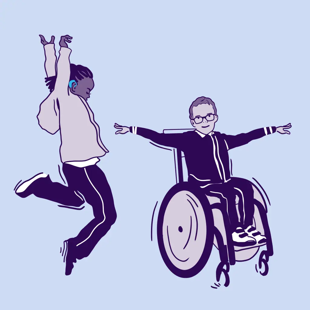
Illustrations: Trimmed, Streamlined, Intentional
As an illustrator first, illustration is one of the most joyful aspects of branding for me. Originally, we had a lot of them. But over time, I had to cut the fat.
I simplified line thickness, removed fluff, and established rules on how, when, and where to use them.
Illustration Rules:
No gradients
Only one color per illustration
Must be used in high contrast
Appears with purpose (e.g. package icons, step visuals, section flourishes)
In the past, we decorated pages freely. Sometimes it worked—often it distracted. Rules bring intention.
Take a peek at our final Comprehensive Brand Guide!
This is what we’ve created for our own brand and also how we format all of our client deliverables for Comprehensive Brand Guide and our Brand Identity & Website Suite!
Design Elements: From Free-for-All to Focus
Our early brand used bold shapes, but over time we introduced intricate lines and background elements. We were trying everything and it started to show.
When you have too many options, the brand starts to lose direction and structure.
DIY branding makes it easy to sneak things in—and hard to stop. It leads to decision fatigue, visual overwhelm, and eventually…you start hating your brand without knowing why.
We stripped away everything that didn’t support the original bold shapes. What remained was a fluid, artistic system that worked for both web and print.
The Power of a Brand Guide
After all these changes, one truth remains:
A brand guide isn’t there to restrict you—it’s there to protect your peace.
If you’re designing a carousel and wondering why it doesn’t look right, a brand guide will show you why. With defined rules around font size, button color, illustration use, and photo treatment, you stop second-guessing and start creating confidently.
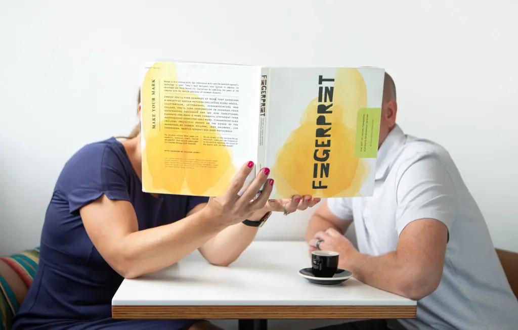
Finishing Touch! A New Brand Photo Shoot
Once our brand guide felt in order, we had to step up our brand photography to match!
Final Thoughts: Structure Creates Freedom
When you have 50 colors, 20 design elements, and multiple fonts, it feels like freedom. But that’s not freedom—it’s noise.
If your brand is just a nice logo and your favorite color, we hate to break it to you: Houston, you have a problem.
Branding takes work, skill, and strategy. You need just enough—not too much—to curate an effective identity. The more structure you have, the more your creativity can actually thrive.
Get Inspired & Stay Ahead
Straight to Your Inbox!
- Branding & marketing tips to help your business shine.
- Insightful advice to make your brand unforgettable and connect with your dream clients.
- Be the first to know about open bookings and special offers.
- Thoughtful, actionable ideas — no fluff, just creative value.