Brand Success Tips for Small Business
Designing for Brand Success
Creating a strong brand identity is crucial for small businesses aiming to stand out in competitive markets. A well-crafted brand not only reflects your company’s values and vision but also fosters trust and loyalty among customers.
By implementing these strategies, small businesses can develop a compelling brand that not only attracts but also retains customers, paving the way for long-term success.

Define Your Brand Identity: Clearly articulate your mission, values, and target audience to ensure all branding elements align with your company’s ethos.
Consistent Visual Elements: Utilize cohesive colors, typography, and imagery across all platforms to create a recognizable and professional brand image.
Align Illustrations with Brand Values: Custom illustrations should reflect your brand’s personality and resonate with your audience, enhancing overall engagement.
Stay Updated with Design Trends: Continuously evolve by incorporating modern design techniques and technologies to keep your brand relevant and appealing.
Brand Design Strategy: Aligning Illustration with Brand Identity
Navigating through the bustling market of brands, standing out requires more than just a flashy logo or a catchy name. If you’ve been wondering how to make a brand for your business, you need more than just visuals—you need a brand identity that embodies your values, voice, and vision. Let’s dive into the essential steps to create a brand that resonates and retains loyalty.

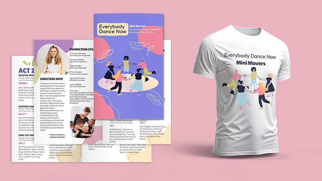
Creating art that aligns with a company’s brand requires a strong brand design strategy that reflects the brand identity, values, and audience needs. Whether building visuals from scratch or enhancing an existing brand, following proven brand success tips for small businesses ensures a cohesive and compelling brand presence.
Before any project, it’s essential to get thorough information about the company’s existing brand via a brand book, including mission statements, personality, target demographic, and current visual style.
Next is the brainstorming and sketching phase, during which we create rough ideas for concepts that reflect and align with the company brand. This is also a great time to experiment with expanding the visual brand even further.
New and exciting techniques, styles, and technology are constantly evolving. As an illustrator/designer, I must stay ahead of these trends and apply them effectively. Staying relevant in any field requires continuous learning and building on skills, including the visual extension of your expertise.

Start Your Branding
Journey Today!
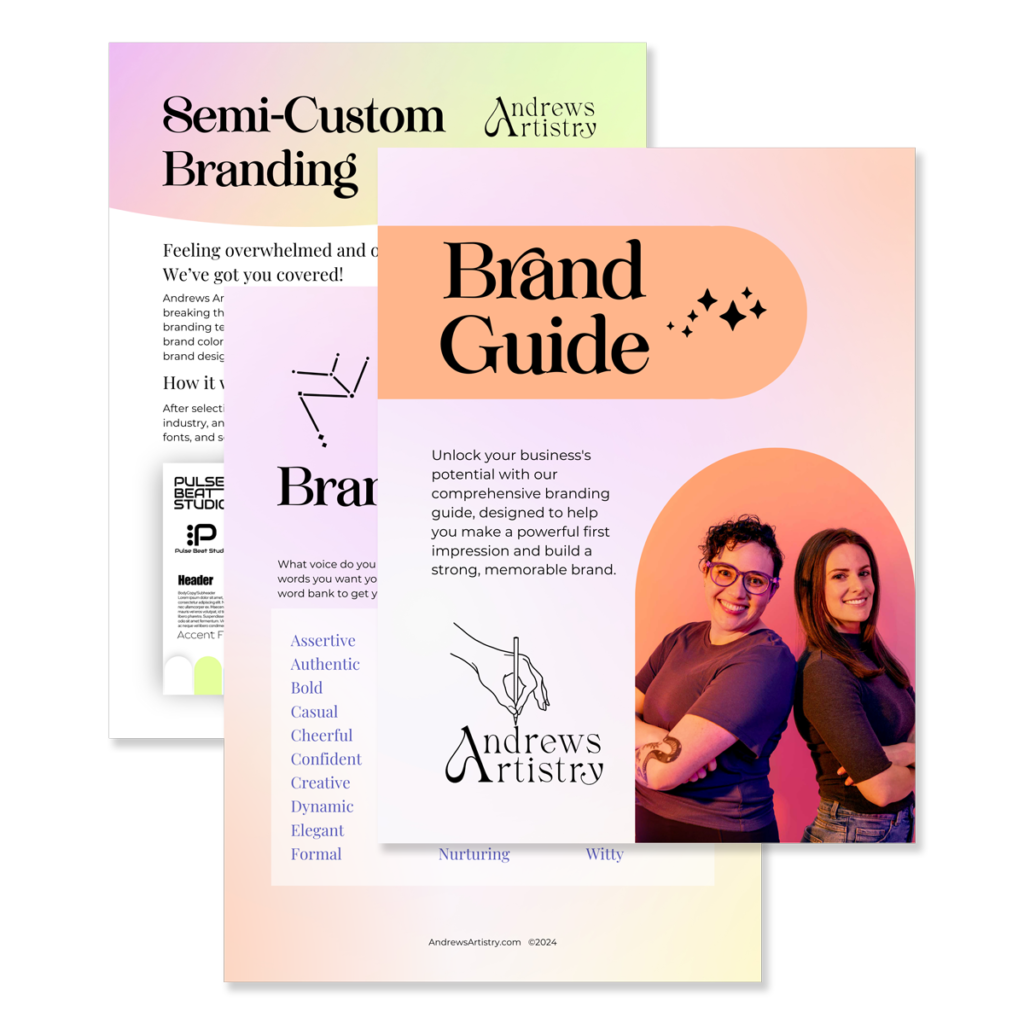
Branding builds trust and loyalty with your customers and differentiates you from your competitors. Take the guesswork out of your brand image and follow our free guide to get started.
Includes: brand voice, fonts, colors, visual treatments and more!
Brand Success Tips for Small Business
Case Study – Feel the Beat
We worked with one of our favorite brands, Feel the Beat, whose mission is to make dance accessible to all by allowing those who are deaf and hard of hearing or who identify with disabilities to literally feel the beat, granting them access to music.
The company already had a clear focus and target audience but recognized it was stuck with stock icons that worked but didn’t elevate the brand. We took the time to add unique dance icons that showed accessibility that stock icons didn’t offer and fun, energetic illustrations of dancers of all sizes, abilities, and backgrounds. These have become a staple on all their digital and social ads, making the brand feel alive, dynamic, and fun while honoring its primary goal and style.

Brand Design Strategy in Action
Dance Ed Tips Case Study
Another example is Dance Ed Tips, a company that sparks creativity in dance teachers by providing resources like card decks, games, and teaching tools to keep their classes fresh and exciting.
We worked with them on a new card deck showcasing correct techniques and beginner positions and poses of Ballet. Since they already had various technique decks and games, it was essential to review their past work to maintain consistency. However, we also identified opportunities to modernize their visual identity.
Ballet is traditionally tied to strict, regimented movements that inform a formal aesthetic. We saw an opportunity to break these stereotypes by using a gender-neutral color scheme and incorporating varying body types, shapes, ethnicities, and gender fluidity.
This new deck still fits their existing brand, adding a fresh visual perspective and greater accessibility and representation.

Brand Success Through Strategic Design
Creating art that matches a company’s brand is an interactive process that requires communication and refinement. Keeping the brand’s mission and visual identity at the forefront ensures that new ideas enhance the brand rather than dilute its essence.
Small businesses can transform their brand identity into a powerful asset by implementing a strong brand design strategy. Using brand success tips for small businesses, you can refine visuals, enhance recognition, and attract your ideal audience.
Explore more illustration and branding insights in our gallery!
Our latest blog, in your inbox!
- Branding & Marketing Tips that inspire and help you elevate your business.
- Insightful advice on making your brand unforgettable and connecting with your audience.
- First notice of open bookings and discounted offers.
- Thoughtful, actionable content—no fluff, just value.
