Importance of Book Formatting and Cover Design Unveiled
The Crucial Role of Book Formatting and Cover Design
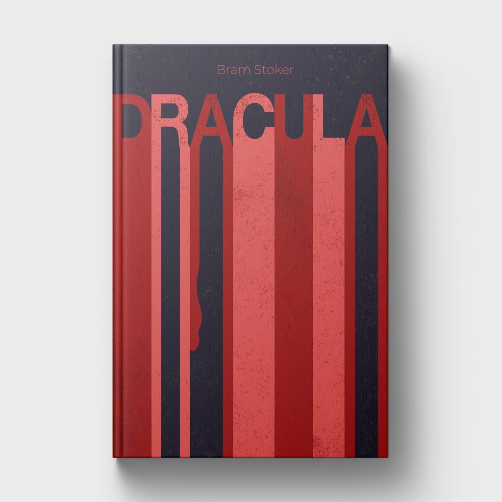
In the competitive publishing world, a book’s cover design and interior formatting are pivotal in attracting readers and enhancing their reading experience. A compelling cover is a visual ambassador, capturing attention and conveying the book’s essence, while meticulous formatting ensures readability and reflects professionalism.
Investing in thoughtful cover design and interior formatting is not just about aesthetics; it’s about creating a cohesive and engaging product that resonates with readers and stands out in a crowded marketplace.

First Impressions Matter: A captivating cover entices potential readers and sets the tone for your book.
Brand Consistency: Uniform design elements across a series or an author’s works build brand recognition and trust.
Enhanced Readability: Proper formatting, including appropriate font choices and spacing, ensures a seamless reading experience.
Marketing Edge: Well-designed books stand out in the market, increasing the likelihood of purchase.
Professionalism: Attention to design details reflects the author’s commitment to quality, influencing reader perception and reviews.
Why Readers Do Judge Books by Their Cover
In self-publishing, where words weave magic and stories come to life, two unsung heroes often determine book’s success before the reader even dives into the first chapter: book formatting and cover design. This blog post explores the importance of these often-overlooked elements that can make or break an author’s literary masterpiece.
The saying “don’t judge a book by its cover” is often overlooked. The truth is that readers do judge books by their covers, and the design of paperback covers and dust jackets plays a crucial role in attracting potential readers. This blog explores the art and science behind book cover design (paperback or dust jacket) and interior formatting (what the words on the page look like).

The First Impression
Picture a potential reader scrolling through an online bookstore or perusing a shelf at their favorite bookstore. What catches their eye? More often than not, it’s a captivating book cover. A well-designed cover serves as the visual ambassador for your work, enticing readers to pick it up and explore further.
Branding
A professionally crafted cover captures attention and sparks curiosity. It also conveys the mood, genre, and style of your story, guiding readers to understand what lies within. This is also known as branding. Maintaining consistency in your book’s appearance, both outside and inside, is crucial, especially if you’re writing a series. Even for standalone books, establishing a visual brand helps readers immediately recognize your work without searching for the author’s name on the book jacket.
Marketing Advantage
In a crowded market, a standout cover gives your book a marketing edge. It increases the likelihood of readers clicking on your book in online listings or picking it up in a physical store. Consistent branding, such as using the same cover fonts or hiring the same book cover illustrator, ensures that previous readers can quickly recognize your newer works, increasing the chances of another purchase.

Formatting: Where Beauty Meets Readability
Imagine commissioning a stunning cover but neglecting to properly format the interior. A reader may purchase your book with enthusiasm, only to find the font too small or the text falling into the gutter (the center of the book where pages meet). This can lead to frustration and abandonment of the book.
Well-executed formatting ensures a seamless and enjoyable reading experience. Design is a powerful tool that visually breaks up your story, reflecting the pacing intended by the author. Just as a well-dressed person makes a good impression, a well-formatted book exudes professionalism, reflecting an author’s commitment to delivering a polished product. In the digital age, proper formatting ensures that your book translates well to various devices, providing a positive user experience for digital readers.
Considerations for DIY Formatting
If you decide to take on formatting yourself, here are a few things to consider when designing.
Typography Matters More Than You Think
The way text is presented inside a book significantly impacts readability and aesthetics. Choosing the right typeface is not just about personal preference—it shapes the reading experience. Serif fonts like Garamond and Baskerville are commonly used in printed books because they guide the eye smoothly along the page, while sans-serif fonts like Helvetica or Arial are often better suited for digital reading.
Key considerations for book typography include:
- Font size – Ensure readability for all audiences. A standard print size is 11–12 pt.
- Line spacing – Proper spacing (leading) prevents text from feeling cramped or overwhelming.
- Margins & gutters – Adequate spacing ensures text doesn’t disappear into the book’s spine.
- Chapter headings & breaks – Visually distinct headers help organize content and enhance the reader’s flow.
Consistent typography across your book interior and cover creates a professional, cohesive look that reinforces branding and readability.
How Proper Formatting Enhances Readability
Imagine reading a book with inconsistent spacing, no paragraph indents, and text running too close to the page edges. Poor formatting disrupts the reading experience and may even lead to negative reviews.
A well-formatted book should:
- Have uniform line spacing – Avoid awkward gaps or inconsistent paragraph spacing.
- Use appropriate margins – Pages should look clean and balanced.
- Provide distinct section breaks – Scene shifts should be clear, preventing confusion.
- Ensure ebook compatibility – Formatting should adjust seamlessly to different screen sizes and e-readers.
Whether you are formatting for print or digital, attention to these details ensures readers stay immersed in the story rather than distracted by design flaws.
Download our free book cover template!
Ready to create your own book cover? Your free downloadable template is just a click away!
Beyond Aesthetics: Book Formatting and Cover Design Influence Sales
Readers make snap judgments when browsing books. A strong cover design creates immediate interest, while proper formatting ensures they remain engaged after purchase. Skipping these crucial elements can result in lower sales and poor reader retention.
Here’s why investing in professional book design pays off:
- Increased discoverability – A well-designed cover helps your book stand out in competitive marketplaces.
- Higher perceived value – Professionally formatted books appear polished and credible, attracting more readers.
- Better reading experience – Thoughtful design keeps readers engaged and reduces fatigue.
- More sales & positive reviews – Satisfied readers are likelier to leave reviews and recommend your book.
Ultimately, book formatting and cover design work together. Even the most compelling story needs the right presentation to gain traction in the market.
When to Hire a Book Cover Artist
- If you’re feeling overwhelmed or not comfortable with visual design and layout design.
- You want that ‘wow’ factor that draws an audience.
Conclusion: Elevate Your Book with Thoughtful Design
Your book deserves the same level of craftsmanship on the outside and inside as you put into writing it. Whether you’re an indie author or working with a publisher, prioritizing book formatting and cover design can make all the difference in how your book is received.
If you’re looking for expert guidance in book design, formatting, or branding your author presence, we can help!

Our latest blog, in your inbox!
✨ Branding & Marketing Tips that inspire and help you elevate your business.
✨ Insightful advice on making your brand unforgettable and connecting with your audience.
✨ Delivered 1-2 times per month, with thoughtful, actionable content—no fluff, just value.


