Book Cover Fonts
What Typeface to Use on My Book
Choosing the Right Typeface for Captivating Stories
Choosing the right typeface is crucial for crafting captivating stories, as it sets the tone, reflects the genre, and enhances readability. A well-selected font not only attracts readers but also immerses them in the narrative, making your book stand out.
By carefully selecting and pairing typefaces, you can effectively communicate your story’s essence, engage your audience, and leave a lasting impression.

Genre Alignment: Match your typeface to your story’s genre—e.g., bold, edgy fonts for thrillers; elegant cursive for romances—to meet reader expectations.
Historical Context: For period pieces, use fonts from the relevant era to authentically convey the setting.
Readability: Ensure your chosen font is legible across various sizes and devices, maintaining clarity without sacrificing style.
Font Pairing: Carefully combine fonts—such as a handwritten style with a sans-serif—to create visual interest without clutter.
Contrast and Hierarchy: Utilize font size, weight, and color contrast to guide readers’ attention and highlight key elements.
A Comprehensive Guide for Crafting Striking Book Covers
Choosing the right book cover fonts for your story is a crucial creative component that sets the tone, communicates the genre, and grabs audience attention. If you’re wondering what typeface to use on my book, this guide will walk you through essential considerations.
Determine the genre or target audience you are trying to reach. For example a thriller, horror story will most likely lean into Bold edgy typefaces while a romantic story may utilize elegant cursive fonts. If your story straddles many different genres this is an opportunity to dig deeper to the core message within your story. You may break the expected norms of a genre font on purpose to clue your audience and readers into the undertones of the story.
Look at the title itself and the content. Is your story set in a specific time period? You could pull common fonts used in that era to further communicate its setting like a historical vintage style font or vaudevillian posters. Pinterest is a great resource to shop for era specific posters and advertisements.
The Importance of Balance in Book Cover Fonts
Be sure your font is still legible. While a beautiful font might seem appealing, it’s not the right choice if it’s not readable. You want the title to be immediately legible and recognizable.
While creative book cover fonts can add personality and style to a design, they must not sacrifice clarity. Remember that the primary purpose of text is to be read. When selecting a font, always test its readability across various sizes and devices to ensure your audience can easily understand your message without straining.

Use contrast to make your text stand out and guide the reader to the most important parts of your content. Contrast can be achieved through font size, weight, and color. For instance, pairing a bold headline font with a lighter body text can effectively draw attention to key areas, making the content not only more engaging but also more organized.
What Typeface to Use on My Book: Font Pairing Tips
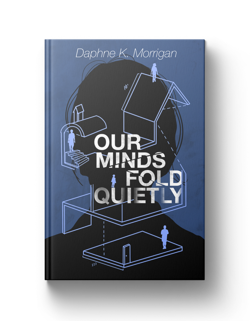
Many successful book covers utilize two different fonts. This can be a tricky balance as the fonts should look visually appealing together, distinct enough to show separation without being too dissonant. A common struggle is deciding what typeface to use in my book while ensuring the fonts complement each other.
For example, handwritten is a great font to combine with sans-serif (lacking strokes or tails in the letters). One is more straightforward, while the other carries a flourish. If you select two elaborate handwritten fonts, they will likely compete, as there will be too much information for the reader to digest, making the text feel hectic.
A good test for font pairings is to look at them together from a distance. Is one competing with the other and drawing too much focus, causing you to miss words in the title?
Handwritten fonts, for example, pair well with sans-serif fonts (which lack strokes or tails in the letters). One is simple, while the other carries a flourish. However, selecting two elaborate handwritten fonts will likely create too much visual clutter.
Test and eliminate. It’s easy to fall in love with too many font options. I’m guilty of this every time I shop around for fonts for my clients. A sound system I’ve used to help narrow down is typing your title with each font and stacking all those fonts together on one page to begin your first elimination process. If you already have colors or designs for the cover, start putting those remaining fonts over the top and continue eliminating them.
Ideally, you should choose a maximum of 3-4 options and experiment with their placement, size, and arrangement. If you end up with several different fonts, such as handwritten and serif, combine them creatively.
At this point, you may start hitting decision fatigue. The words start looking like not actual words and you start spiraling, don’t panic! This is normal. This is a great time to save your final few options and step away for an hour to reset your eyeballs. If you have a trusted creative partner, let them check it out; they might notice something you didn’t! After giving yourself a break, you’ll be shocked at what you catch, and the final selection may feel like a no-brainer.
Final Thoughts on Choosing Book Cover Fonts
Hierarchy is important! This means your most important information should be the largest in size, while the author’s name or tagline should be smaller. Avoid making these elements the same size, as it confuses the reader about what’s most important.
Kerning is the space between your letters. Many typefaces space their letters evenly, but not always! If you visually notice discrepancies, manually adjust them for a balanced appearance.

Letter spacing can also communicate a story. For instance, a book called Breathe might have widely spaced letters, while a thriller about claustrophobia might use tight spacing to create a sense of tension.
Explore different kerning and letter spacing options on Google Fonts.
If you’re feeling overwhelmed or stuck, that’s okay! Endless possibilities can be both exciting and challenging. If you need help selecting the right book cover fonts, I’d love to assist with your creative project to ensure your cover reflects the magic inside.
Our latest blog, in your inbox!
- Branding & Marketing Tips that inspire and help you elevate your business.
- Insightful advice on making your brand unforgettable and connecting with your audience.
- First notice of open bookings and discounted offers.
- Thoughtful, actionable content—no fluff, just value.