Rebranding Social Studio Designs into Avail
A Support-Driven Brand for Dance Studio Owners
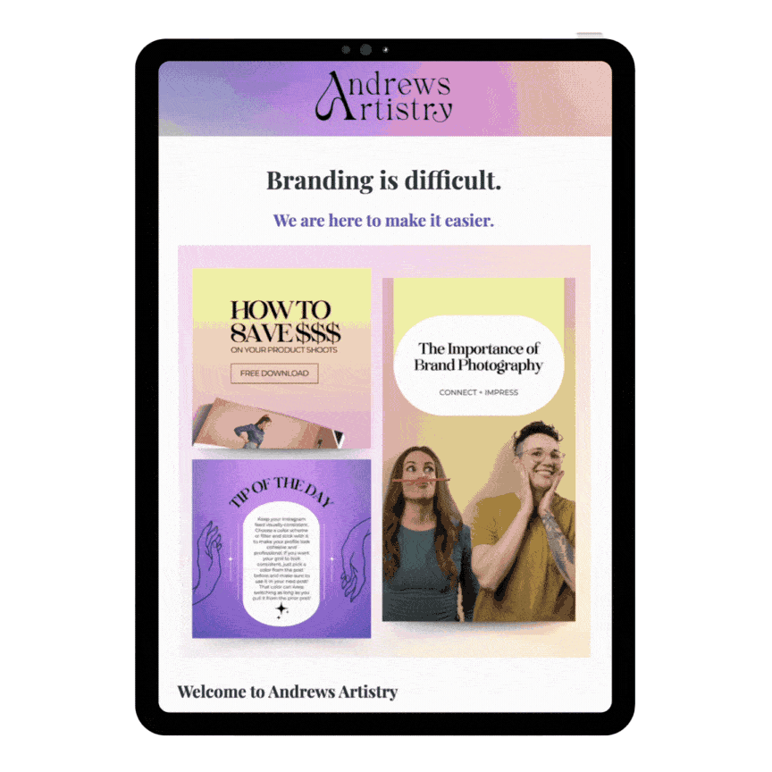
Avail Virtual Assistance Rebrand
Jenny, founder of Social Studio Designs, came to us ready to evolve. While her business originally focused on social media support for dance studios, her services had grown into something much bigger—offering administrative, operational, and strategic assistance so studio owners could focus on their communities.
The brand, however, hadn’t caught up.
What We Did:
Clarified brand positioning and audience
Supported the transition from Social Studio Designs to Avail Virtual Assistance
Designed a warm, professional visual identity rooted in trust, care, and reliability
Created a full brand guide including voice, tone, mission, and values
The Outcome:
A cohesive, elevated brand that reflects the full scope of Jenny’s work—supportive, professional, and built for long-term growth alongside the studio owners she serves.
The Challenge: When Your Services Outgrow Your Brand
Jenny works with dance studio owners who are juggling everything—classes, staff, parents, schedules, emails, and social media—often all at once. Her background in dance allows her to hire team members who understand studio life, making her support feel intuitive rather than transactional.
Her clients aren’t just business owners.
They’re community builders.
And they needed a brand that reflected that level of care.
Strategy First: Defining the Brand Direction
We began with our branding questionnaire and a collaborative moodboard exercise to understand:
Who Jenny truly serves
What her clients value most
How she wanted people to feel when interacting with her brand
Target Audience
Dance studio owners—primarily in their 40s and 50s—focused on business growth, who deeply value their families, friendships, and studio communities, and are actively looking for reliable support.
Brand Personality
Jenny wanted her brand to feel:
Professional, but personal
Thoughtful, caring, and empathetic
Classic and trustworthy, without feeling cold or corporate
This clarity guided every creative decision that followed.
Naming the Brand: Introducing Avail
We knew the name mattered. Together, we evaluated potential options through a strategic lens:
Is it easy to say and hear?
Is it intuitive to spell and remember?
Does it reflect the experience clients will have?
Avail rose to the top because it communicates exactly what Jenny offers: presence, support, and readiness. The name feels calm, capable, and reassuring—everything her clients are looking for when they reach out for help.
A Strong Brand Starts With Knowing What You Stand For
When your brand voice, mission, and values are clear, every decision—from visuals to messaging—gets easier.
If you’re building or refining a service-based business and want a clearer foundation, our free Brand Clarity Kit helps you define what matters most before you move forward.
Strategy First: Defining the Brand Direction

Logo Design
We designed a wordmark-style logo that is:
Simple, clean, and modern
Flexible enough for digital and print use
Professional without feeling rigid
Key design details:
A neoclassical serif typeface with elegant thick-to-thin contrast to signal sophistication
A paired sans serif to keep the brand grounded and approachable
A custom modification to the “A,” removing the crossbar and replacing it with a flowing arch—symbolizing uplift, growth, and forward movement
A diamond-shaped dot over the “i” to add subtle sophistication and perceived value
The result is a logo that feels intentional, refined, and quietly confident.

Color Palette
Jenny already had a strong instinct for color—leaning toward pinks, blacks, blues, and whites. However, many of the shades she gravitated toward were heavily trend-driven and muted.
To help Avail stand out, we:
Refined the core palette to retain familiarity
Introduced select tertiary colors with more vibrancy and warmth
Created opportunities for lightness and visual interest without overwhelming the brand
These accent tones aren’t meant to dominate—but they add dimension and approachability when used intentionally.

Illustrations & Texture
To soften the brand while keeping it elevated, we introduced:
Minimal floral linework illustrations to reflect care and femininity
Subtle watercolor strokes for texture and movement
Paper and marble-inspired textures to create a tactile, human feel
These elements help Avail stand apart from stark, ultra-minimal service brands—adding warmth and connection without sacrificing professionalism.

Typography
Typography was chosen to balance elegance with approachability:
Cyrillic Bodoni for headers—classic, refined, and expressive
Italicized versions for emotional emphasis without clutter
Quicksand for body copy—modern, friendly, and easy to read
Together, the type system supports clarity, trust, and accessibility.
Brand Voice, Mission & Values
As part of the brand guide, we developed a clear framework for how Avail shows up—visually and verbally.

Mission
Avail supports busy studio owners by managing communications, accounts, and social media—so they can focus on teaching, leading, and building their communities.
Core Values
Support: Relieving stress through knowledgeable assistance
Empowerment: Helping clients bring their vision to life
Consistency: Providing reliable, on-brand execution
We also expanded Jenny’s brand voice to include:
creative, collaborative, and reliable—along with AI prompts to ensure future content stays aligned as the business grows.
The Result: A Brand Built to Support Growth
Avail now has a brand that reflects what Jenny actually offers—not just what she started with.
The new identity:
Clearly communicates expanded services
Feels warm, trustworthy, and professional
Resonates with studio owners seeking real support
Positions Avail for sustainable, long-term growth
Most importantly, it mirrors the experience clients have when working with Jenny and her team: supported, understood, and taken care of.


When Your Brand Matches the Way You Serve
Jenny didn’t need a louder brand.
She needed a clearer one.
By aligning Avail’s strategy, visuals, and voice, we created a brand that does what she does best—shows up, lightens the load, and helps others thrive.
And that’s what good branding should always do.
Book a free consultation if you need help with your brand or website!
Get Inspired & Stay Ahead
- Branding & marketing tips to help your business shine.
- Insightful advice to make your brand unforgettable and connect with your dream clients.
- Be the first to know about open bookings and special offers.
- Thoughtful, actionable ideas — no fluff, just creative value.