Guide the Viewer’s Eye Effectively
Rule of Thirds in Design
Use the Rule of Thirds for Better Design Composition
Want to create visually engaging designs? The rule of thirds in design helps guide the viewer’s eye and improve composition for balanced, dynamic visuals.
Want to improve your design compositions? Keep reading for expert tips!

- Enhance visual balance – Position key elements along grid lines for a natural flow.
- Avoid static compositions – Off-center subjects create movement and interest.
- Use gridlines – Many design tools include the rule of thirds guides for better placement.
- Try other techniques – The golden ratio, leading lines, and rule of odds add variety.
- Break the rules when needed – Great design is about knowing when to follow and experiment.
What is the Rule of Thirds and Why is it Important.
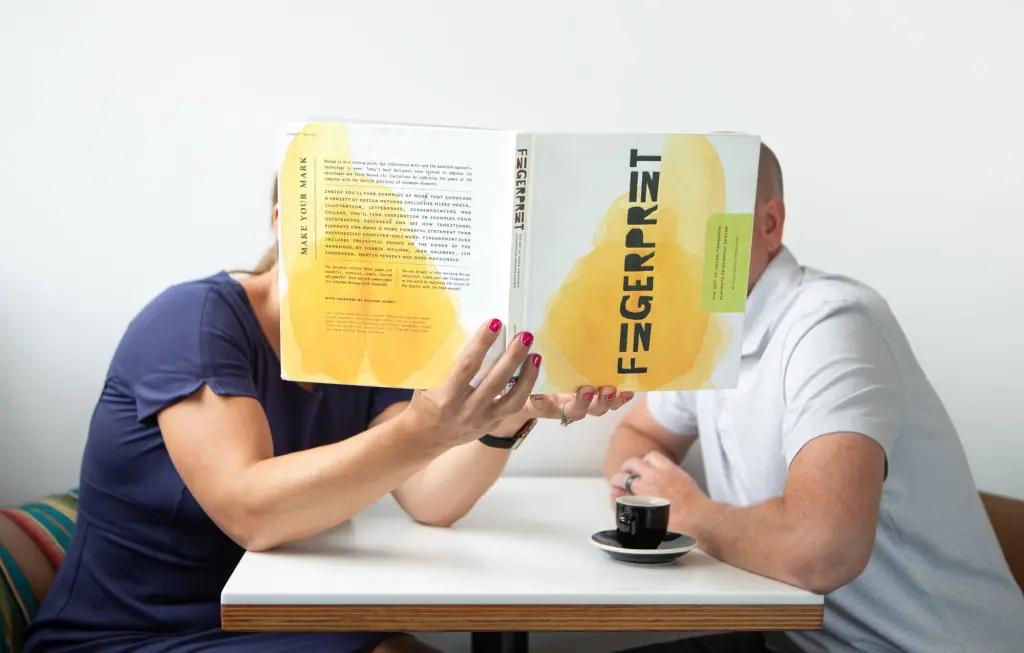
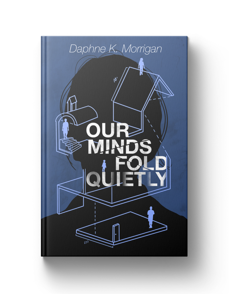
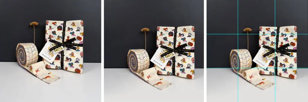
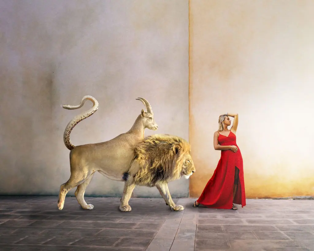
In visual arts, including design, photography, and illustration, the rule of thirds is a fundamental principle that enhances composition by creating balance and guiding the viewer’s eye. This technique divides an image into nine equal parts using two equally spaced horizontal lines and two equally spaced vertical lines, forming a grid. Key elements are then positioned along these lines or their intersections, resulting in a more dynamic and appealing composition.
Understanding the Rule of Thirds in Design
The rule of thirds discourages placing subjects directly in the center of the frame, which can lead to static and less engaging images.
By aligning subjects with the grid lines or their intersections, designers can create a sense of movement and interest, naturally leading the viewer’s eye through the composition. This approach is widely used in various visual mediums, from photography to graphic design, to create balanced and harmonious layouts.
Applying the rule of thirds in your design work can significantly enhance the visual impact of your projects. Here are some practical steps to incorporate this principle:
Activate Gridlines: Most design software and camera interfaces offer a grid overlay feature. Enable this to visualize the rule of thirds grid as you work.
Position Key Elements: Place important components of your design, such as focal points or subjects, along the grid lines or at their intersections. This placement creates a more engaging and balanced composition.
Horizon Alignment: In landscape designs or photographs, align the horizon with either the top or bottom horizontal grid line to avoid splitting the image in half, thus creating a more dynamic scene.
Beyond the Rule of Thirds: Exploring Other Composition Techniques
While the rule of thirds is a valuable guideline, exploring other compositional techniques can further enhance your design skills:
Golden Ratio: This mathematical ratio, often found in nature, can be used to create aesthetically pleasing compositions. It involves dividing elements in a way that the ratio of the smaller part to the larger part is the same as that of the larger part to the whole.
Rule of Odds: This principle suggests that an odd number of subjects in an image is more engaging than an even number, as it creates a sense of balance and harmony.
Leading Lines: Use natural lines within your composition to direct the viewer’s attention to specific areas, creating a sense of depth and focus.
Conclusion
The rule of thirds serves as an excellent starting point for creating dynamic, balanced, and professional imagery. By thoughtfully applying this principle, you can guide the viewer’s eye through your work, enhancing engagement and visual appeal. Remember, while rules in art and design provide valuable frameworks, they can also be creatively broken to achieve unique and compelling results.
Our latest blog, in your inbox!
- Branding & Marketing Tips that inspire and help you elevate your business.
- Insightful advice on making your brand unforgettable and connecting with your audience.
- First notice of open bookings and discounted offers.
- Thoughtful, actionable content—no fluff, just value.