
Creating a Cohesive Brand for a Multidisciplinary Artist
Identifying the Throughline That Unifies Art, Movement, and Voice
Mary Jo Lasky, Artist & Dancer Branding
The Challenge:
Mary Jo Lasky is a multidisciplinary artist working across fine art, dance, performance, and writing. The challenge wasn’t a lack of clarity in her work—it was how to communicate all of it as one cohesive, recognizable brand.
What We Did:
Identified the throughline connecting Mary Jo’s creative practices
Designed a retro-modern visual identity rooted in movement and energy
Created a simple website and bold brand photography
Developed future-facing brand mockups to show how her brand can grow
The Outcome:
A vibrant, flexible brand system that captures Mary Jo’s energy and point of view—built to support both her current work and what she plans to create next.
One Artist, Many Mediums, One Clear Point of View
Mary Jo Lasky is the kind of artist who makes an impression the moment you meet her.
She works across fine art, dance, and performance, bringing a sense of exuberance, rhythm, and confidence into everything she creates. Her work feels playful and alive, but never scattered—there’s intention behind the energy.
She’s cool in that effortless way. The kind of creative presence people want to be around and learn from.
Our goal was to translate that feeling into a brand—so her audience experiences that same spark before ever meeting her in person.

The Core Question: Finding the Throughline
When an artist works in multiple disciplines, branding isn’t about listing everything they do. It’s about identifying the perspective that ties it all together.
For Mary Jo, that meant uncovering:
The rhythm that runs through her work
The balance of playfulness and maturity
The way movement informs her visual language and storytelling
Once that throughline was clear, everything else snapped into place.
Creative Direction: Retro Energy, Modern Expression
During the discovery process, Mary Jo created a moodboard of inspiration—and one theme emerged immediately: a love for 1970s aesthetics.
But not nostalgia for nostalgia’s sake.
She was drawn to the era’s warmth, color, and expressiveness—reimagined through a modern lens that feels current and confident. This became the foundation for the brand’s visual direction.
Visual Identity Design

Logo Design
We started by selecting a typeface with inherent personality, then customized it to become uniquely Mary Jo’s.
The final logo features:
Extended tails on the M and J, reaching in opposite directions
A sense of motion, as if the letters themselves are dancing
A balance of expression and clarity
The mark feels alive—mirroring Mary Jo’s movement-based practice and creative energy.
Color Palette
Pulling from 70s-inspired color palettes can quickly go sideways. We were intentional about modernizing the reference.
The final palette includes:
A vibrant, joyful orange
Soft modern pinks and warm beige tones
Deep wood hues and grounded greens
The result is bold without being overwhelming, playful without feeling dated—and still one of our favorite palettes to work with.
Typography
With a visually expressive brand system already in place, typography needed to support the work rather than steal focus.
Header font: Bauer Bodoni — a modern serif with classic thick-and-thin contrast
Body copy: Roboto — clean, condensed, and highly readable
Accent font: A stacked, multi-line style used sparingly to reflect the Bauhaus illustrations
Together, the typography creates balance, clarity, and cohesion across platforms.
Illustration & Graphic Elements
Mary Jo’s dance background played a major role here.
We introduced Bauhaus-inspired line illustrations designed to:
Move beyond their containers
Shift and flow with rhythm
Echo the thick-and-thin contrast found in her logo
Two line weights allow for flexibility—light and airy in some applications, bold and graphic in others. These elements add motion, energy, and personality without competing with her photography.
A Clear Voice Lets Your Work Speak Louder
When your work spans multiple disciplines, clarity is what helps people understand who you are—not just what you do.
Our Free Brand Clarity Kit helps artists and creatives identify their throughline, define their perspective, and build a foundation that supports everything they make.
Bringing the Brand to Life
Branding doesn’t stop at a guide—it has to work in the real world.
Photography
We created bold brand photography and headshots designed for multiple uses, including casting submissions, press, and performance opportunities. Color gels added an extra layer of playfulness and confidence, reinforcing the vibrancy of the brand.
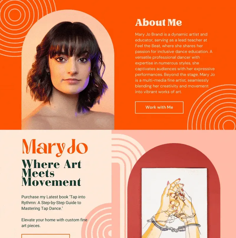
Website Design
Mary Jo’s website was designed to be simple, intuitive, and visually driven:
Clear navigation
Strong imagery
A focused introduction to her work and creative voice
It acts as a home base—supporting her multidisciplinary practice without overwhelming visitors.

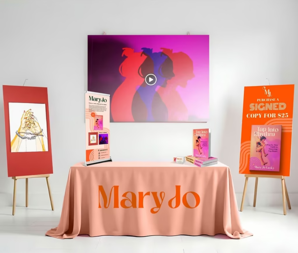
Book Cover Concept (Future-Facing Mockup)
We designed a conceptual book cover mockup to demonstrate how her brand could extend seamlessly into publishing.
This wasn’t about finalizing a product—it was about showing how her brand system supports future offerings. Using existing typography, color, photography, and graphic elements, the mockup proves that Mary Jo’s brand is flexible, scalable, and ready for what comes next.
Extending the Brand Beyond the Screen
As an artist and author, Mary Jo plans to attend events to grow her audience and share her work. We helped mock up the look and feel of her event table—balancing clarity, hierarchy, and visual interest so passersby immediately understand who she is and are drawn in.
We love working beyond screens and into real-world applications, helping clients think holistically about how their brand shows up everywhere it lives.

The Result
Mary Jo now has a brand that:
Unifies multiple creative disciplines
Reflects her energy, maturity, and point of view
Supports both current work and future projects
Feels cohesive across digital, print, and in-person experiences
Instead of explaining everything she does, her brand now lets people feel it.
Designing for Growth, Not Just Today
Strong brands don’t just capture who you are now—they leave room for who you’re becoming.
By identifying Mary Jo’s creative throughline and designing a flexible, expressive system around it, we created a brand that can grow alongside her work—whether that’s on stage, on the page, or somewhere entirely new.
We believe in being creative partners for the long haul. When we understand where you’re headed, we can help you build something that supports the entire journey.
Book a free consultation if you need help with your brand!
Get Inspired & Stay Ahead
- Branding & marketing tips to help your business shine.
- Insightful advice to make your brand unforgettable and connect with your dream clients.
- Be the first to know about open bookings and special offers.
- Thoughtful, actionable ideas — no fluff, just creative value.