
Dance Studio Brand Refresh: Modernizing Feel the Beat
A Nonprofit Rebrand That Kept the Soul but Found a New Groove
Breathing New Life into a Beloved Brand
How a little design tune-up turned into a full identity refresh
When we first sat down with the team at Feel the Beat, we talked less about colors and logos and more about their people. Their students. The families who show up every week. This is a nonprofit making music and movement accessible to the deaf and hard-of-hearing community, so everything they put out into the world needed to feel alive and welcoming.
In the end, here’s what changed:
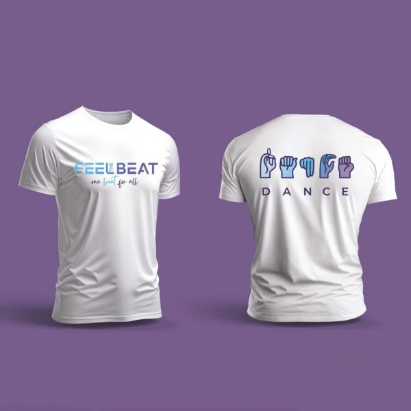
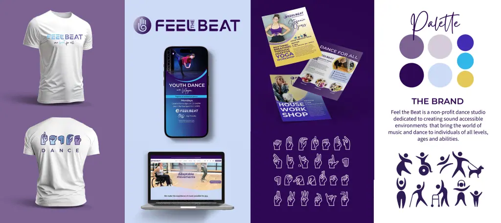
A logo that still has their iconic ASL hand, but now moves with rhythm
A color palette that’s brighter, deeper, and more flexible
Custom ASL-inspired icons so their visuals speak clearly without words
Little design details—curves, gradients, shapes—that bring a sense of motion to everything they make
Why It Was Time for a Change
Their old branding wasn’t “bad” — it just didn’t dance the way they do. The logo was familiar, but the rest of the look had gone a bit flat, especially the single-shade purple they’d been using for years. They wanted to keep what people recognized, but make it sing again.
From First Sketches to Final Files
Keeping the Familiar, Adding the Flow
The ASL hand had to stay—it’s part of their DNA. But what if the letters could move? I started drawing soft, wavy lines that wove through the type, almost like sound waves. Suddenly the name felt alive.
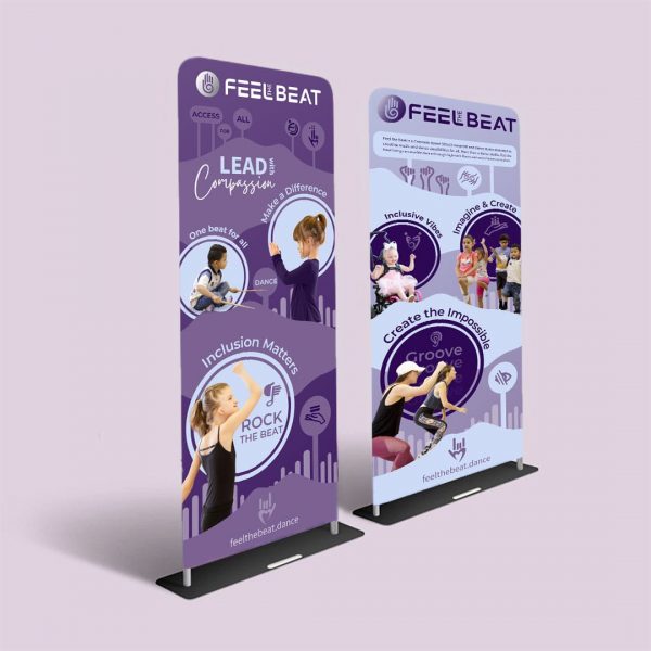
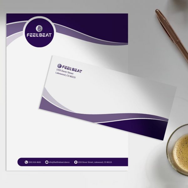
Giving Purple Some Company
That purple got some new friends—warm yellows, cool blues, and a few gradients that shift like stage lights. Now they can pull together a soft, calming layout for one project or a high-energy, bold spread for another without losing their identity.

Looking Past the Logo
Fonts That Play Well Everywhere
We chose typefaces that could handle a recital program, a T-shirt design, and an Instagram post without looking out of place.
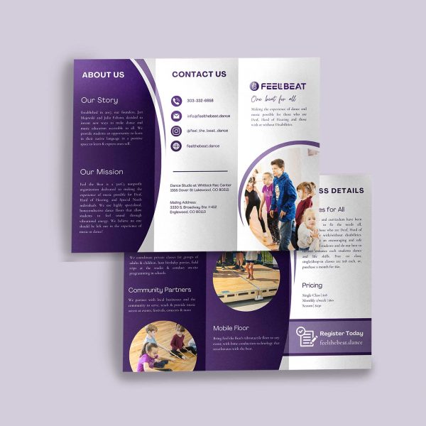
Designing for Accessibility
Because their community relies on strong visual cues, we built a custom ASL alphabet and icon set. No more stock images that don’t quite fit—everything is now theirs.
Adding Movement to Every Piece
We snuck in curved lines, circular frames, and concentric shapes wherever they fit. It’s subtle, but together these elements give their designs a sense of motion, even on a still page.
We craft websites that inspire and convert.
What Other Studios Can Borrow from This Project
Renewing a brand is not about getting rid of everything and doing it all over again. It’s about retaining the essence of what people already know and rely upon, and adding in new updates that make sense for where you are today.
Below are a few takeaways that other dance studios (or honestly, any arts-based business) can learn from:
• Keep the familiar factors. Since your fan base already has an affiliation with a symbol, color, or slogan, do not eliminate it. Work with it. For Feel the Beat, the ASL hand was too familiar to be changed—it just needed revamping.
• Color can make your story change. Introducing just two or three more colors can completely change the feel of your materials. A fun accent for a teen program, a more laid-back color scheme for adult workshops—all of a sudden your brand can accompany you.
• Custom is always worth it. Stock graphics are quick, but they rarely capture your spirit. A few custom icons or illustrations make your visuals feel like yours alone.
• Not logos, but systems thinking. Your logo is the shake, but the ongoing visuals—the type, the photos, the social posts—are the dialogue. Consistency across all of it creates trust more rapidly than can any isolated graphic.
A refresh of the brand can seem daunting, but don’t forget: it’s often a refinement, not a reinvention.

The Bigger Picture: Why Branding Matters
These days, students and their families have unlimited options. What brings them to your studio? It’s hardly ever location or schedule. Far, far more often, it’s whether they feel connected on an emotional level.
That’s where branding comes in. It’s not just about looking polished; it’s about showing who you are before someone even walks in the door.
For Feel the Beat, the updated visuals are now:
• Mirror their inclusive mission
• Communicate joy and movement without words
• Help them stand out when applying for grants, partnerships, and press features
Good branding is like a quiet ambassador. Even when you’re not in the room, your posters, website, or social posts are speaking for you. And when those elements look deliberate, others trust you sooner. They trust your professionalism, your mission, and your delivery abilities.
Want to Refresh Your Studio’s Look?
If your logo hasn’t been revamped in years, your palette is uninteresting, or your brochures are stitched together from different eras of your studio’s history—it’s perhaps time to revamp.
This is what that might look like:
• Restoring your logo to make it look up-to-date without compromising its character Development of a color scheme that changes with classes, events, and promotions
• Crafting bespoke components that make your brand immediately identifiable
• Crafting a system whereby each of your flyerts, posts, or emails feels like it belongs to the same family I love that blend of familiarity and rejuvenation for studios. What’s left is a brand that’s true to who you are in the moment, but still has room for where you’re going to be next. When you are ready to discover what a rebrand can offer your studio, I want to hear from you. Together, we can develop an identity that is more than aesthetically pleasing—it facilitates your evolution and allows your narrative to speak to the folks you most want to reach.
Get Inspired & Stay Ahead
Straight to Your Inbox!
- Branding & marketing tips to help your business shine.
- Insightful advice to make your brand unforgettable and connect with your dream clients.
- Be the first to know about open bookings and special offers.
- Thoughtful, actionable ideas — no fluff, just creative value.